Between PPs, result charts, and wagering ticket summaries, the way that horse racing information has been presented to regular fans hasn’t changed very much over the years. In this post, I use data visualizations to try to increase comprehension of advanced wagering advice.
It was May of 2017 when, deep into the development of Handycapper, I took a break and browsed Twitter.
I saw a tweet from Darin Zoccali (@atTheTrack7) referencing a column he published at DRF.com titled, “Trust is a must or your handicapping game is a bust” (archive link).
In this column, Darin explained how a well-known wagering professional, @InsideThePylons (ITP), had called out inefficiencies and mistakes in the construction of Pick 4 tickets Darin had posted in late 2016. Darin reported that this advice had helped him wager smarter, increase churn, and win far more when his opinion was correct.
Intrigued, I wanted to find this conversation, and, with a little Twitter Search-fu, I was able to locate the Pick 4 in question.
As I tried to understand the finer points of ticket construction @InsideThePylons was making, I remember making a mental note that this kind of feedback would be a great candidate to potentially benefit from data visualizations to aid understanding, for the average racing fan, of the interaction between Darin and ITP.
TL;DR? Skip directly to the interactive visualization or view a demonstration video.
The Pick 4 Tickets
The exchange started with Darin posting his $0.50 Pick 4 tickets for @TheMeadowlands Pick 4 pool for races 7 through 10:
Put in my pick 4 tickets for @TheMeadowlands. Pretty high on Alexie Mattosie tonight. Using Fool Me Once in a back-up ticket. pic.twitter.com/B6P4AfxVaM
— Darin Zoccali (@atTheTrack7) December 10, 2016
In short, Darin wagered $99 on four Pick 4 tickets.
He called out a strong preference for #8 Alexie Mattosie in Race 9, but used #7 Fool Me Once in the same race in “back-up” tickets.
Judgement from ITP was swift:
I mean how could you possibly ever make a bet again in your life if it came 1/2 to 4 to 7 to 6?
— Inside The Pylons (@InsideThePylons) December 10, 2016
Eyeballing the individual tickets Darin had posted, I could see ITP was correct.
Indeed, using a Sankey diagram (you may have seen one previously from Hello Race Fans’s “Paths to the Kentucky Derby”) to visualize the four individual Pick 4 tickets emphasized the lack of coverage:
But I had a more fundamental question - would an inefficient multi-ticket structure be immediately identifiable with a more advanced, interactive perspective?
Implicit Choices
You played $36 keying Fool out of the $54 keying Alexie and removed the 2 bombs to save the $18 + keyed the bombs on press?
— Inside The Pylons (@InsideThePylons) December 10, 2016
It’s worth explaining @InsideThePylons’s tweet:
“You played $36 keying Fool out of the $54 keying Alexie”
The $36 refers to the $12 ticket (3,4,5,8 / 1,2,4,5,8,9 / 7 / 6) plus the $24 ticket (3,4,5,8 / 1,2,4,5,8,9 / 7 / 1,3).
The $54 ticket (1,2,3,4,5,8 / 1,2,4,5,8,9 / 8 / 1,3,6) differs only to the above tickets by using #1 and #2 in the first leg (Race 7) and replacing #7 Fool Me Once with #8 Alexie Mattosie in the third leg (Race 9).
“removed the 2 bombs to save the $18”
The “2 bombs” refer to #1 (ML 12/1, race odds 23/1) and #2 (ML 12/1, race odds 30/1) in the first leg (Race 7) that were not present in the tickets keying #7 Fool Me Once in the third leg (Race 9).
These odds are not identified in the tickets posted above, but ITP was aware of them.
By not using these longshots, there was a difference of $18 between the $36 ($24 + $12) tickets and the $54 ticket.
“keyed the bombs on press”
However, Darin also added a $9 ticket (1,2,4 / 8,9 / 8 / 1,3,6), which ITP is referring to as the “press”:
How can you like 124 best in 1st leg but eliminate 12 on the ticket with Fool?
— Inside The Pylons (@InsideThePylons) December 10, 2016
What this $9 ticket implies is that, on top of the $54 ticket that singles #8 Alexie Mattosie in the third leg of the Pick 4 (Race 9), there is further investment in both this opinion, and the opinion that #1, #2, and #4 (race odds, 2.20) are Darin’s “most liked” choices in the first leg (Race 7), and similarly #8 (1.10) and #9 (16.90) in the second leg (Race 8).
The “bombs” (#1 and #2 referred to earlier) are present in this ticket, yet absent from the $36 investment in the two tickets that single #7 Fool Me Once in the third leg (Race 9).
Why would you go out of your way to remove "joker" and save $18 but play another ticket pressing joker that you removed?
— Inside The Pylons (@InsideThePylons) December 10, 2016
Looking back, I think Darin himself would acknowledge that the above tickets were not constructed optimally, and his subsequent DRF article details how he changed his approach going forward.
Visualizing Inefficient Tickets
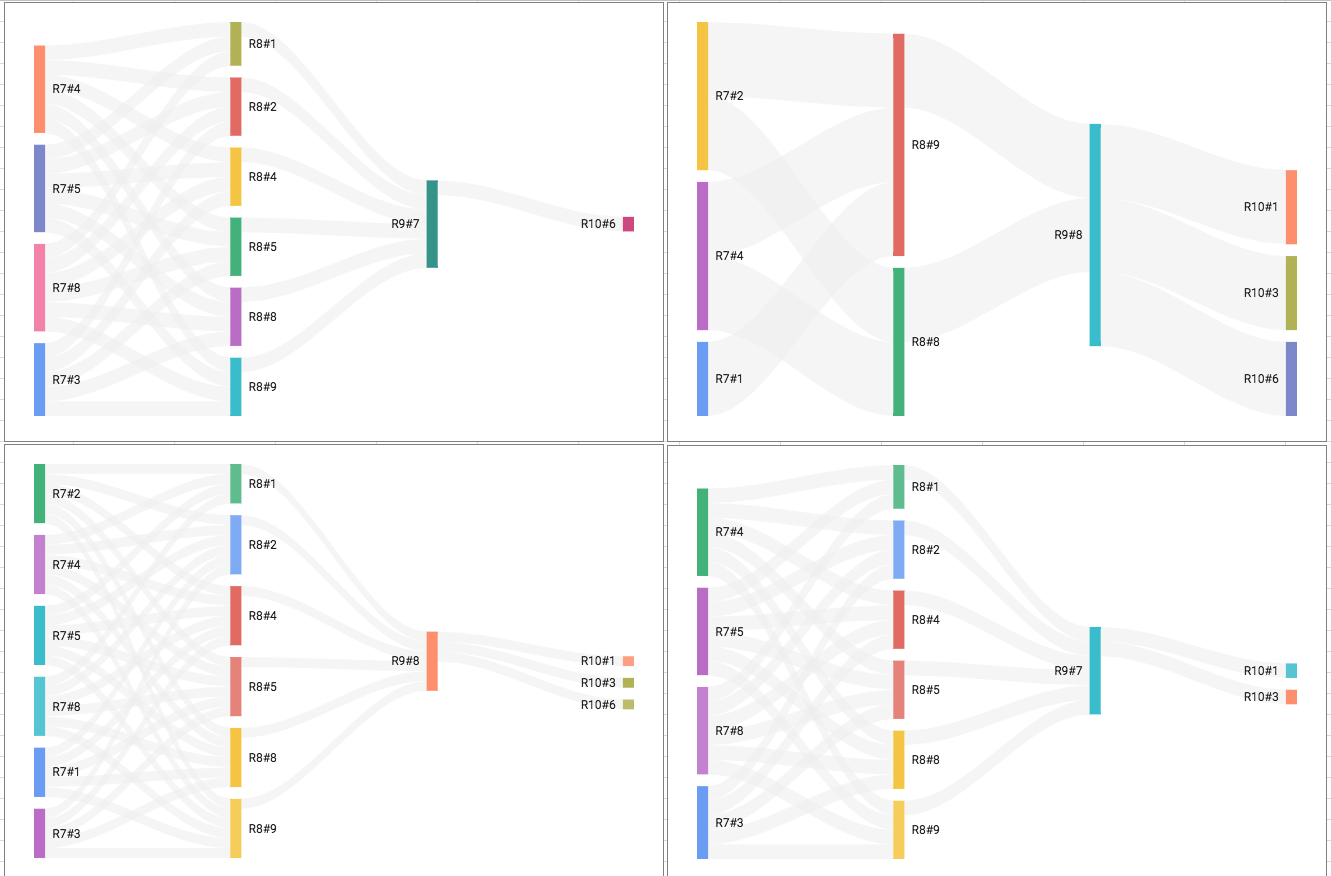
I had already used Sankey diagrams above to display the four Pick 4 tickets, but the traditional implementation of this chart is to highlight single links between coupled nodes (e.g. between #8 in Race 9 and #1 in Race 10) rather than the end-to-end nature of a Pick 4 ticket (where a selection in every leg must win for the ticket to payoff, excluding consolations).
I wanted something that would aggregate all four Pick 4 tickets into a single parallel set visualization, but still respect the combinatorial mathematics in-play with four separate tickets. I also wanted to quickly answer questions like:
- How many ticket combinations use #8 Alexie Mattosie versus #7 Fool Me Once in the third leg (Race 9)?
- How many ticket combinations use the #9 in the second leg (Race 8) and the #8 in the third leg (Race 9)?
- Who is used in more tickets: the #3 in the first leg (Race 7) or the #9 in the second leg (Race 8)?
Fortunately, I discovered a variation of Sankey with end-to-end highlighting, developed by Ming Qin, which visualized the famous “Titanic Survivors” data set, which is commonly used as an exercise in statistical thinking.
This implementation used a flow-based API that enabled end-to-end highlighting of that flow, plus additional features like rich tooltips and draggable nodes, that I could further leverage.
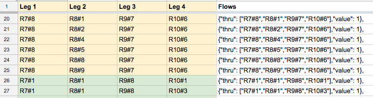
Using a Google Spreadsheet, I manually described the 198 combinations that Darin’s $99 50c Pick 4 tickets covered (though automating this would be straightforward) and then used a formula to construct the flow node objects used by the library:
Then it was just a matter of copy/pasting the nodes and flows into the appropriate asset file and the visualization was ready.
So here is the actual interactive visualization!
Click here for a larger standalone version of the visualization
The standalone visualization is open-source and available on GitHub.
Explanation of the Visualization
The above diagram has a few special features that are worth understanding:
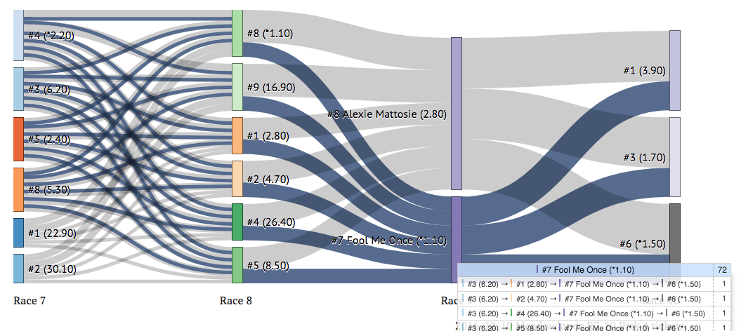
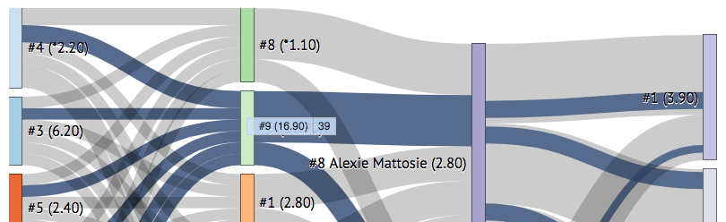
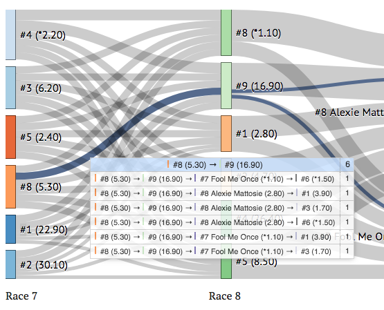
- Using your cursor, hover over a rectangular node (representing a horse in a race) to see all the combinations that flow through it across all tickets. In the following example, we can see that #9 in the second leg has 39 combinations including it.
By hovering over #7 Fool Me Once, you can clearly see that no combinations that use him in the third leg (Race 9), also use #1 or #2 in the first leg (Race 7) - exactly to ITP’s point!
- Hover over the dark-blue links between the nodes - these represent a connection between a selection in each of two legs, as well as visually showing the paths (and their frequency) of any incoming or outgoing combinations.
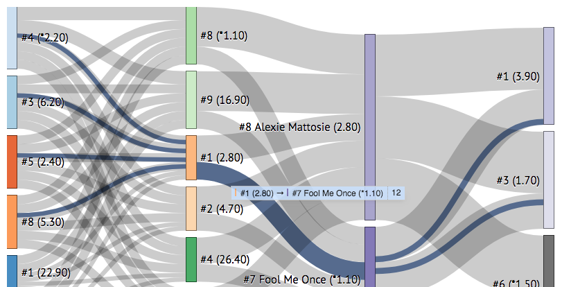
In the above example, you can see that 12 of the 198 combinations use #1 in the second leg (Race 8) and #7 Fool Me Once in the third leg (Race 9). This can be also useful to find live tickets quickly.
- By double-clicking on a highlighted link, you can get a rich tooltip that outlines all of the actual combinations (e.g. viable paths in a ticket) involving that link:
I can envision interesting information being added here; for example, expected payoffs or even advice that the combination is too “chalky”.
- Each rectangular node can be moved by dragging them, but I haven’t really found a compelling reason to do that for this particular visualization.
Conclusion
So, does this visualization satisfy the goal of aiding understanding of the structuring issues behind the multiple Pick 4 tickets?
Maybe.
There are several improvements I can think of, primarily about more clearly delineating each ticket’s combinations and perhaps being able to filter certain tickets and/or combinations.
I do think that ADW’s could start thinking about presenting their wagering tickets in a more dynamic and interactive way, or at least allow them to be shared that way.
There may even be a product opportunity here - a “wagering assistant” that reviews placed wagers and highlights inefficient ticket structures.
However, I go back to what I said when I charted HANA’s track ratings against the 2017 racing calendar in a spreadsheet:
Is there any major insight gained by this data visualization? Probably not. But that's not the point. Today, there are a myriad of distribution options to extend both the reach & the form of content. Much of that can come from regular fans. That engagement should be encouraged.
— Robin Howlett (@robinhowlett) August 7, 2018
Comments